When I first read about the Corona crisis in the newspaper in early January 2020, it said, “Already 34 people have died from the new disease”. “And now?” thought I. Is that a lot or not? 34 out of a total of 40 on one boat? That would be a lot, because that would be 85%. 34 in a city of 12 million people? That would be very little, because that would be 0.00028%, or 28 in 10,000,000.
You can see from this little example: numbers without context make only limited sense. My colleague, the mathematician Thomas Ostermann, has shown in another blog on the topic of corona how fear is stoked by media dissemination of false information on the alleged exponential growth of those infected with Sars-CoV-2. Of course, exponential growth eventually stops when saturation is reached.
And it is the same when bare figures are thrown around.
In Italy, one could read on April 2, 2020, 105,792 Covid-19 cases had been reported, of which 12,430 were dead. That would be a so-called case-fatality rate of 11.7%, i.e. the proportion of people who died of the infected. In Germany, there were 73,522 infected persons on the same day, of whom 872 died. That makes a case-fatality rate of 1.2%. It is therefore almost 10 times lower than in Italy. Why is that? Is that realistic?
We see from this small numerical example that pitfalls lurk in bare numbers without context. For one thing, we would need a representative survey of those infected: in other words, we would have to know how many people are or were really infected and how many of these people who were infected were actually ill. This is the only way to calculate a very important epidemiological indicator, namely the disease rate. It tells us how many percent of a population actually have the disease. And the ratio of infected to sick people tells us something about how dangerous an infection is.
Let us assume that a large group of people becomes infected with a pathogen that is completely new to the human immune system, rabies, for example. Then the vast majority of those who come into contact with the pathogen will also become ill. This was the case, for example, when Europeans brought colds to the New World. The indigenous tribes there were completely defenceless against these viruses, which are harmless to us Europeans, and died by the dozen. The novel “Blackrobe”/”Schwarzrock” by Brian Moore describes this historical episode.
But only a few pathogens are 100% pathogenic for humans. We have natural immunity to many, acquired immunity to some, and if we don’t have any, then a strong immune system will still fight off some before symptoms occur. Then we will be “positive” via an immunological test, but not experience any illness. And still other people may become ill before they overcome the pathogen and gain immunity.
So we need to distinguish several categories:
- Some do not come into contact with the pathogen at all
- Some come into contact with the pathogen but with no symptoms of disease – immune and pathogen negative; at most IgG antibody-positive, indicating previous defence against the pathogen
- Some come into contact with the pathogen, not immune but without symptoms because a rapid immune response has eliminated the pathogen – asymptomatic but pathogen-positive
- Some come into contact with the pathogen, not immune and became ill
- A subcategory of these people are those who are so severely ill that they die from the disease
1) may depend on how infectious a pathogen is or how easily it can be contracted. Diseases such as chickenpox, for example, are extremely infectious and are rapidly transported everywhere. Tetanus, on the other hand, is very difficult to catch: you have to spend half an hour or so in horse manure, because the tetanus pathogen is an anaerobic bacterium, i.e. it only thrives in the absence of air. This category depends, of course, on the measures taken against contact with the pathogen.
During the plague epidemics of the Middle Ages some Cities closed their gates and were spared. But even there, some people are likely to have been in category 2) or 3).
The ratio of 4) to the total population gives an important parameter, the morbidity rate. Here is a table I took from a publication of the Robert Koch Institute [1]. It describes key figures of the last major epidemics, all of which, mind you, ran through without any major measures to contain or ward off the virus.
| Pandemic | Illness rate in % | Deaths | Mortality per 100,000 | Letality in % |
| 1918/19 | 25 | 426,600 | 691 | 2.76 |
| 1957/58 “Asiatic. Flu” | 31 | 29,100 | 40 | 0.13 |
| 1968-70 “Hong Kong flu | 21 | 46,900 | 60 | 0.29 |
| 2009 “Swine flu | 9 | 350 | 0.43 | 0.0048 |
You can see from this that the disease rate, i.e. above category 4)/population rate, even in the highly infectious and dangerous flu epidemics never affected more than one third of the population. Whether this is due to the fact that not everyone comes into contact with the pathogen (category 1), or are already immune (2), or experience only mild symptoms or no symptoms at all in spite of infection (3) is irrelevant for this figure, and most of the time we do not know.
In a classic study, Cohen and colleagues infected 394 medical students studying for exams with relatively harmless rhino, syncytium and coronaviruses that cause the common cold [2]. There is a whole range of harmless coronaviruses. The authors actually wanted to know what the stress of exams does to students. Interestingly, the serological infection rate, i.e. the number of cases where it could be proven that am infection occurred, was between 74% and 90%, even though all of them had been applied viruses directly into the nose. This means that despite direct contact, infection does not necessarily occur, e.g. because mucosal immunoglobulins (mostly immunoglobulins (mostly class A) neutralize the pathogens immediately. They would be people in category 2) or 3) above. And the real incidence of disease was between 27% and 47%. These are people in category 4) above.
So this morbidity rate is a key variable. Because it provides information on the frequency of the disease – or, in the case of contact with the pathogen, about the probability of contracting the disease.
How can you estimate the rate of disease? Well, you can do it afterwards, when the epidemic is over. Then you know how many people got sick, as is the case for the large epidemic waves in Table 1. Or in the case of Cohen’s study, because there the authors knew that they had directly infected everyone. What do you have to do when you find out, as you did now, during an ongoing wave of disease with a novel type of pathogen? Yes, that’s right: you have to test a sample that is representative of the population to find out how many people are ill – and you have to do this several times, because that is the only way to map the dynamics.
Because this is not the case with either the Italian or the German Covid-19 sufferers, we cannot assess whether this epidemic is very dangerous or not. But maybe the case-fatality rate, i.e. the mortality rate of those infected, is correct? After all, they were all tested, right? Again, this is not so simple. Because mainly those who were highly symptomatic were tested, i.e. a negative selection. If we test everyone, say in a particular district, we know how many people are infected, (categories 3) and 4) above), and if we select representative groups for this, as we did for the famous Sunday survey, then the numbers are reliable.
If we only test those who are symptomatic, then we do not find people in category 3), but only in category 4). This means that we miss out on an important piece of information, namely how high the possible immunity is in the population or how infectious the pathogen is. If we find many people who have immunological evidence of a previous infection, i.e. antibodies, without ever having had symptoms, then this means that they are immune to the pathogen. And estimating this percentage in the population could help us to project the upper limit of the disease rate. After all, it can only be at most as high as the percentage of non-immune people in a population. More precisely, about 80% of the non-immune. For when about 60-90% of a population has developed immunity to a pathogen, the reservoir for replications for that pathogen is exhausted and the epidemic dies.
Why is even the colportation of rising case numbers, naked, blank and just like that, a fatal communication error? Again, this is to the fact that we need to see these numbers in relation to the tests that are carried out. Let’s look at the example of Italy and Germany: In Italy, in absolute terms, there are more cases that tested positive for Sars-CoV-2 than in Germany. But does that say anything? No. Because we do not know how many tests have been done in Italy and who was tested. In Germany, comparatively speaking, far more tests were carried out than in Italy, and in Italy only the seriously ill were tested. So the probability of getting a positive result is greater there.
The RKI published for the first time on April 2, 2020 what the proportion of people testing positive was. I reproduce the data in Table 2; the last row is fictitious on my part for demonstration purposes
| Calendar week 2020 | Number of tests | Tested positive |
| 11 | 127,457 | 7.582 (5,9%) |
| 12 | 346,619 | 23.829 (6.8%) |
| Fictitiously invented by me | 80,000,000 | 5,600,000 (7%) |
The following figures appeared on the evening news: “This week, nearly 24,000 people tested positive for Covid-19 compared to 7,582 last week, a three-fold increase! So we see how fast the disease is spreading! Protect yourself, stay home!” So? Is it true? Yes and no? Of course, more have tested positive, but that is not a function of the rapid increase in the disease, but of the testing. As you can see from the percentage figures, the one percentage point increase is very moderate. If the newscaster were to say, “More than 5.5 million people have tested positive for Covid-19, as many as live in Munich and Berlin combined“, then that would seem an enormous a lot. However, if we knew that this had been said on the basis of a full test of the entire of the entire German population, it would be the same percentage as before, namely 7%.
This example is, of course, fictitious, because no one could and would test the entire republic. But you can see from the example: the absolute number of people tested positive only makes sense in the context of the number of tests and, strictly speaking, only in the context of a representative test. Because only then would we know about the true rate of disease.
Whether the disease rate of 7% is a correct estimate, we do not know. It is possible that it is higher. On the ship “Diamond Princess”, which quarantined in Yokohama, almost all of the 3711 passengers and crew members were tested. 17% of them tested positive and of these, 47% were symptomatic and of these, 7 died. This makes a case-fatality rate of 2.3% and an infection-fatality rate of 1.2% [3].
It is unclear whether this vessel gives a clean representation of what is happening with the infection. Because we don’t know how the people on the ship moved around, before the disease was discovered and the sick were quarantined. It’s possible that everyone came into contact with it and many were immune. That is unknown.
Let’s just take this figure of 17% as the disease rate. As can be seen from Table 1, it is close to the known figures from previous epidemics. We take the case-fatality rate of 1.2%, which we can calculate from the German figures at present, because the cruise ship, with its relatively old audience, is not as representative and the German figures might fit a little better for our country. I have compiled the calculation result and various other scenarios in Table 3, always calculated on the approximately 82 million inhabitants of our country.ated for the approximately 82 million inhabitants of our country.
| Sickness rate | Case fatality rate | Sickness to be expected | Deaths to be expected | Mortality per 100,000 |
| 17% | 1.2% | 13.94m | 167,280 | 204 |
| 7% | 1.2% | 5.74m | 68,880 | 84 |
| 3% | 1.2% | 2.46m | 29,520 | 36 |
| 17% | 0.56% | 13.94m | 78,054 | 95 |
| 7% | 0.56% | 5.74m | 32,144 | 39 |
| 3% | 0.56% | 2.46m | 13,776 | 17 |
It is very easy to see from table 3 that the central variable is the morbidity rate, if the case-fatality rate is assumed to be constant. And also the absolute number of expected deaths is actually not a good figure, because it only has meaning when standardized to the number of the population, in this case 82 million. Otherwise, you cannot compare figures from Switzerland, Austria and Italy. (Of course, one could also give percentages instead of mortality per 100,000, but then there would always be many digits after the decimal point, which is impractical, which is why it is usually standardized to 100,000).
We see, if we take the 7% morbidity rate as a basis, which is suggested by the current percentage of people who test positive, then we get a mortality rate that is higher than that of the Hongkong flu epidemic in 1968. The question is how realistic this assumption is. Since only symptomatic people are tested in this Germany, this value is likely to significantly overestimate the true value. Even with a lower morbidity rate, we arrive at a relatively large number of expected deaths, which is somewhat higher than in the last major flu epidemic, which claimed 25,000 excess deaths, i.e. deaths that would not have occurred at that time if no flu epidemic had swept through the country.
If we take as a basis the lethality used by the RKI in its model calculations, i.e. 0.56%, then the figures change significantly.
But we also see: even with a relatively high disease rate, the expected deaths are not anywhere near the range calculated by the scenarios of the RKI, which assumed 350,000 to 400,000 deaths if no measures are taken to isolate sick people and the current measures and which are the basis of the current policy measures [4]. policy measures [4]. Why is this so? Simple. The RKI made a made a model assumption error and assumed that all infected persons also become become symptomatic, i.e. that the morbidity rate is not 17%, as is the case on the on the ship, for example, or 7%, as suggested by testing at the moment, but rather but an estimated 70%. This is an absolute worst-case scenario that is actually hardly justifiable. At least for the moment, no more.
But we also see: Even with a relatively high rate of disease, the deaths to be expected are not anywhere near the range calculated by the RKI scenarios, which assumed 350,000 to 400,000 deaths if no measures are taken to isolate the sick. They form the basis of the current policy measures, anyway [4]. Why is this so? Simple. The RKI made a modelling error and assumed that all infected people also become symptomatic, i.e. that the disease rate is not 17%, as on the ship, for example, or 7%, as suggested by testing at the moment, but an estimated 70%. That is an absolute worst-case scenario that is actually hardly justifiable. At least not for the moment.
This case-fatality rate, or lethality, i.e. the number of patients who become ill and die, is difficult to determine. Because at the moment, all those who die and who test positive for the virus are counted as Covid-19 deaths. Is this permissible? A question of definition. This figure also inflates or reduces lethality, depending on whether the calculation is conservative or liberal.
We see the actual ratio of the Covid-19 pandemic compared to the flu epidemics of this year and previous years in the following figure. It comes from Erwin Kainbacher, a mathematician and engineer from Graz, who kindly made it for me and put it at my disposal.
It is shown in the following figure.
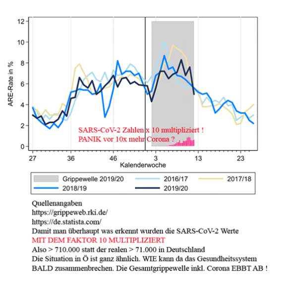
On the left of the page, you can see the number of people with the disease as a percent of the population. The coloured curves are the different flu waves; the black one is the current flu wave. The grey region is the Covid-19 pandemic period. The red bars are the number of people who have contracted Covid-19, but multiplied by a factor of 10 so that they can be seen on this graph! Because otherwise they would disappear. So numbers in proportion look different than they do in absolute terms.
We can see from all these examples how unreliable it is to deal with absolute numbers in epidemiology. Numbers need to be standardized and converted back to basic units so that they can be compared, preferably on the basis of robust empirical findings. Where you don’t have that, you can make different assumptions, as we do here in Table 3, and see how that plays out. Of course, in these examples we have not taken into account the dynamics, but in a sense the end state, which is only known after it is all over. Dynamic modelling is much more complex because the numbers – the rate of disease, the number of people who get sick and the number who recover – are constantly changing and have to be calculated in dynamic models that are functions of time. But even if you study the dynamics, as illustrated, you can see that it only makes sense if you do it in context.
To show that was the point of this exercise.
Sources
- Buchholz, U., Buda, S., Reuß, A., Haas, W., & Uphoff, H. (2016). Todesfälle durch Influenzapandemien in Deutschland 1918 bis 2009. Bundesgesundheitsblatt – Gesundheitsforschung – Gesundheitsschutz, 59(4), 523-536. https://doi:10.1007/s00103-016-2324-9
- Cohen, S., Tyrrell, D. A. J., & Smith, A. P. (1991). Psychological stress and susceptibility to the common cold. New England Journal of Medicine, 325, 606-612. https://www.nejm.org/doi/full/10.1056/NEJM199108293250903
- Russell, T. W., Hellewell, J., Jarvis, C. I., van-Zandvoort, K., Abbott, S., Ratnayake, R., . . . Kucharski, A. J. (2020). Estimating the infection and case fatality ratio for COVID-19 using age-adjusted data from the outbreak on the Diamond Princess cruise ship. Eurosurveillance, 25(12), pii=2000256. https://doi.org/10.2807/1560-7917
- an der Heiden, M., & Buchholz, U. (2020). Modellierung von Beispielszenarien der SARS-CoV-2-Epidemie 2020 in Deutschland. https://doi.org:10.25646/6571.2